Growing Apart is one of the most valuable tools for teaching about labor and inequality that I have seen in recent years. It’s a one-stop place for all the great graphs and charts to show the rise in inequality, the rise of right-to-work states, the declining value of the minimum wage versus the rise in executive pay at the top.This great new website by Colin Gordon is a treasure trove as a teaching resource.
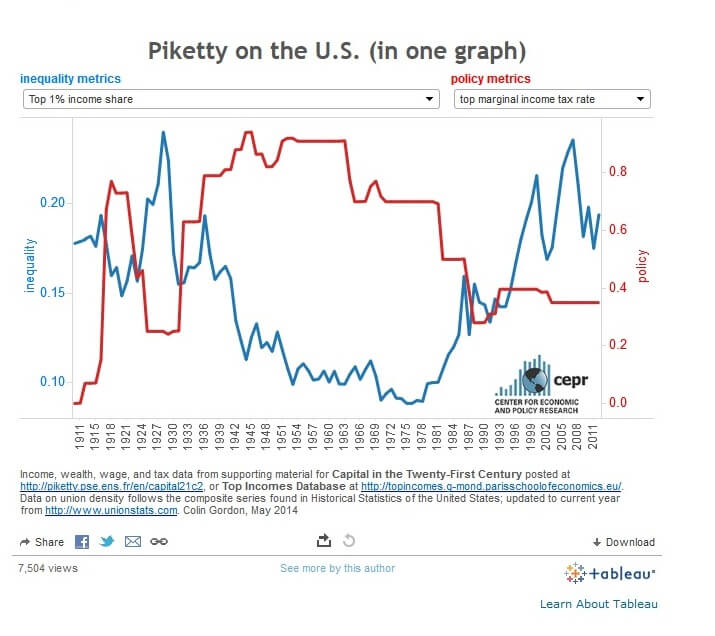
Want to see the acclaimed Thomas Piketty information distilled into one great graph? Here it is, with a summary explanation. The graph has a brief explanation of what the graph shows.
Gordon’s work follows in the tradition and perspectives of the Economic Policy Institute and left- Keynesians, showing the limits of institutional economists who advocate for policies that explain causation of recent inequality in terms of technological changes or global competition.

Gordon presents economics as if labor history matters, and explains inequality by probing long-term historical changes in power dynamics. At the root, he shows, is the reduction of bargaining power for workers through the elimination of unions. He uses the concept of hoarding at the top, and gives us information, both narrative and visual, that emphasizes why wages have remained stagnant.
It’s got a great range of materials: Taxes, corporate profits vs. corporate taxes, occupations of the rich, rise of shadow banking, median wage by education.
I plan to use this site in my labor history class, introduction to U.S. history classes, and capitalism classes in the future.I hope he will graph some of the Leo Panitch and Sam Gindin book, The Making of Global Capitalism, which I would also say is an unparalleled book resource compared to others that are out there. And I admit I’m very grateful to not have to make my way right now through Piketty, instead relying on this great distillation of the 1000+ book in one graph.


