Philip Tipperman: Forgotten Labor Painter of the 1930s
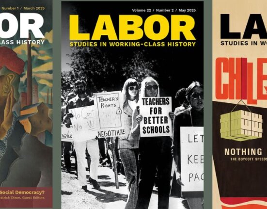
“Philip Tipperman: Forgotten Labor Painter of the 1930s” is the free essay for Vol. 22: 1 of the journal Labor: Studies in Working Class History, thanks to our agreement with Duke University Press. This will available from behind the paywall until June 15, 2025. The essay includes black and white version of the Tipperman paintings. The essay is actually a background narrative and a transcribed conversation that profiles the forgotten art of Phillip Tipperman.
According Patrick Dixon, managing editor of the journal, the artist’s so,n Milt Tipperman, “first reached out to the journal in October 2022 and asked if we would like to review his father’s paintings from the 1930s. It was an unusual request but I was immediately intrigued by the possibility, even more so when I searched both the internet and the library for references to Philip Tipperman and found very few traces of his work.”
Kathy Newman, the new arts and media associate editor for Labor found a permanent home for the art in the library at Brooklyn College. Newman hosted a discussion of Tipperman’s art with Joseph Entin, professor of English and American studies at Brooklyn College, and Patricia Hills, professor emerita of American and African American art at Boston University. Below you will find selections from Newman’s introduction to the essay and selections of the conversation, which can be viewed and accessed for free until July 7, 2025. Labor Online agreed that the color versions of the paintings should be included on our site, and are grateful that the journal allowed us to excerpt part of the intriguing essay.
The excerpts from the published essay were edited by Rosemary Feurer, Labor Online editor, but we encourage you to see the full essay for more insights. In addition, we recommend the podcast from Labor History Today, where you will hear comments from the event at Brooklyn College, including from Milt Tipperman, Miriam Deutch, curator at Brooklyn Library, Julie Greene, editor of Labor, Patrick Dixon, Labor’s managing editor, Patricia Hills, and audience comment.
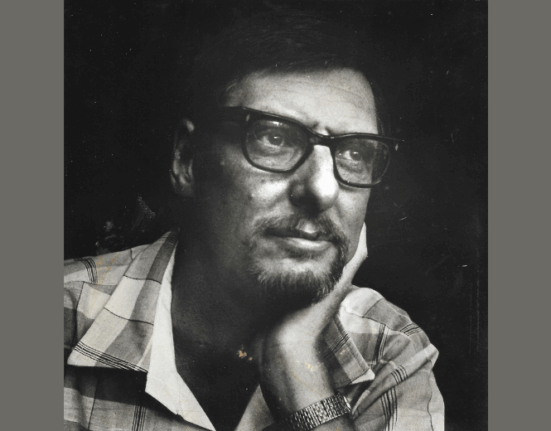
Philip Tipperman, born in 1916, was the son of Jewish immigrants from Poland who ran a candy store in Brooklyn. Tipperman attended Samuel Tilden High School and graduated from Brooklyn College, receiving his BA in fine arts in 1938. After graduation, Tipperman worked briefly at the Metropolitan Museum of Art, illustrating a book on the history of military armor. After that he moved to Washington, DC, where he served as a firefighter for several years before starting a sign business in Silver Spring, Maryland.
Tipperman painted throughout his adult life. In 1947, he had a one-person show of twenty-two watercolors at the Central Public Library in northwest Washington, DC, that was featured in several local newspapers. In the 1960s, he painted watercolors and produced pen-and-ink drawings depicting people, buildings, and landscapes in Maryland and in Maine and Mexico, where he had vacationed. Tipperman suffered from undiagnosed mental illness and took his own life in April 1969.
Tipperman’s 1939 paintings reflect both the Depression decade in which they were made and the artist’s singular style and perspective. The 1930s was an era of great hardship in the United States, especially for working people, many of whom lost their jobs and their homes and struggled to put food on the table. It was also a period of intense labor activism: The Committee (later Congress) of Industrial Organizations, or CIO, was founded, and millions of workers went on strike across industries and around the country. In addition, the period saw immense creativity in the arts, which took a social turn as many writers, photographers, and painters grappled with the economic and political struggles roiling the decade.
Tipperman’s paintings, which focus squarely on labor organizing, pickets, and violence directed at workers, address vital concerns that many other artists, especially those who moved to the left during the 1930s, were also engaging. In these paintings Tipperman centers everyday working people, using bold, angular shapes. Tipperman’s style fuses social realism and modernist experimentation. In this way, his work seems to be in dialogue with better-known painters from the period, including Thomas Hart Benton, Philip Evergood, and Jacob Lawrence. Tipperman’s lively, colorful, hard-hitting images stand out—even against this turbulent decade’s rich cultural landscape.
In January 2024, Labor Arts and Media Associate Editor Kathy M. Newman, Joseph Entin, and Patricia (Pat) Hills hosted a conversation about these paintings.
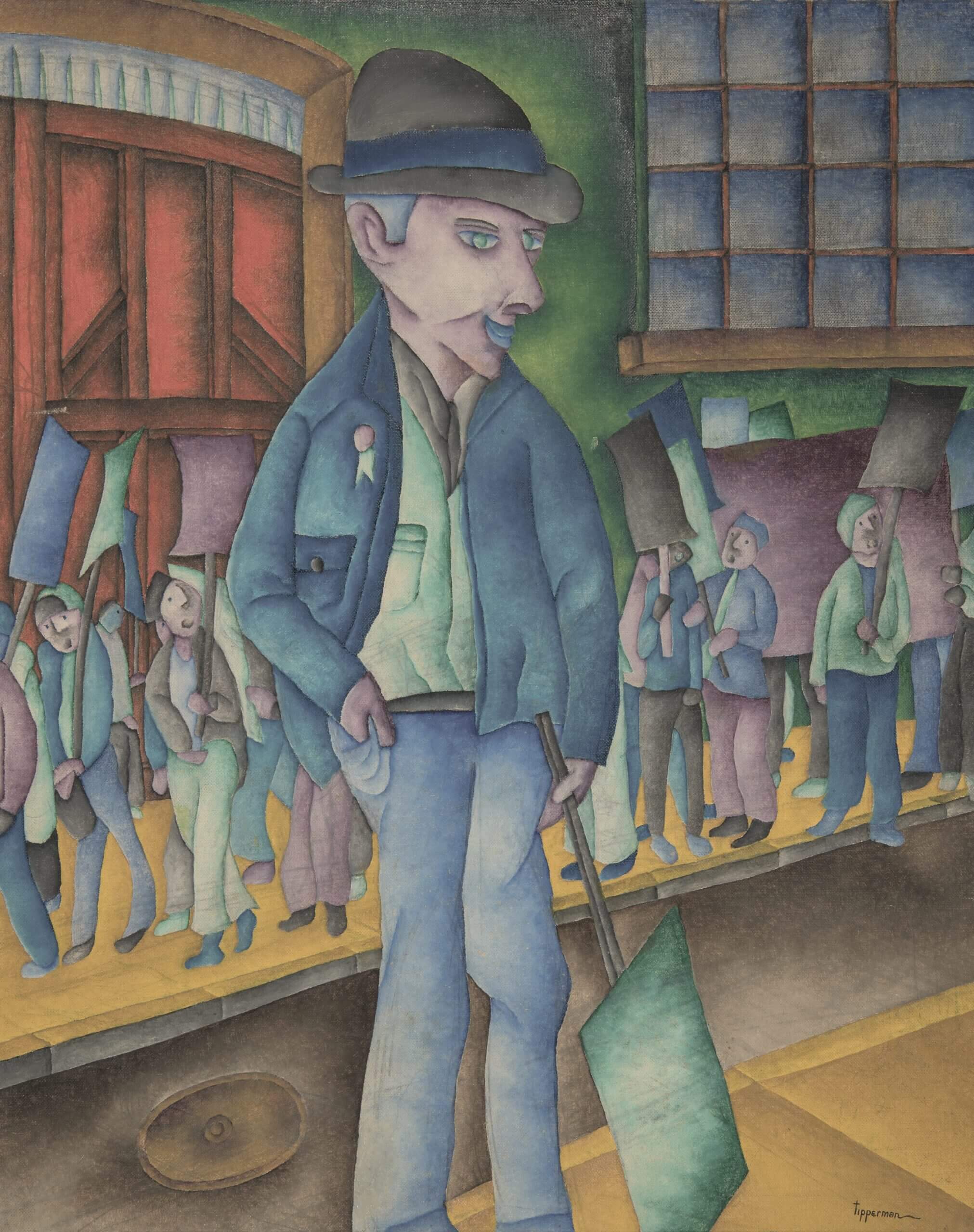
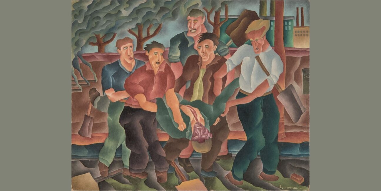
Joseph Entin: I’m interested in the way Tipperman represents the body. In thirties art the body becomes such a critical metaphor—especially for artworks that represent working people and also nonworking people, the unemployed. For these artworks the body becomes an important motif because it’s a way to render the kind of material effects of hardship, things like hunger, starvation, displacement, violence, and injury. And I’m noticing this tendency in Tipperman’s work. Tipperman’s bodies—and they all appear to be male bodies, it should be noted—are large and angular, blocky, twisted, in some cases almost tortured. . .
The last thing I want to mention is the contrast between the lone figure in the foreground and the crowd in the background. The background figures are really in the background. We can’t see them very well as individuals. So there’s a tension between the individual figure out front and the mass in the background. This lone figure in the foreground is one of them, wearing one of their buttons, and he’s carrying a sign. He’s one of their number, but very much individualized—perhaps a union leader. Does this lone figure also represent the artist? Is this a reflection of how Tipperman saw himself, as part of, but also apart from, the masses?
Patricia Hills: I’d also like to point out that this man’s face seems disconnected from the rest of his body. It’s almost like his body can’t hold him up. His left leg looks like it’s going to collapse. By contrast, when you look at his face, his face is one of determination. I think Joseph’s idea of the collective versus the individual—that was a big issue for Tipperman. A lot of people who did not join the Communist Party, or who were not in that orbit, were focusing on individualism, and that’s what they didn’t like about communism—the pressure they might have felt to give up some of their individuality. But other people embraced the collective, because they believed that struggling together might produce a better world. Struggle, actually, might be a word for us to consider. It’s a word that Jacob Lawrence used over and over again. If there’s no struggle, there’s no humanity; if there’s no struggle, there’s no art. Struggle is the operative term. Struggle is what it means to be human.
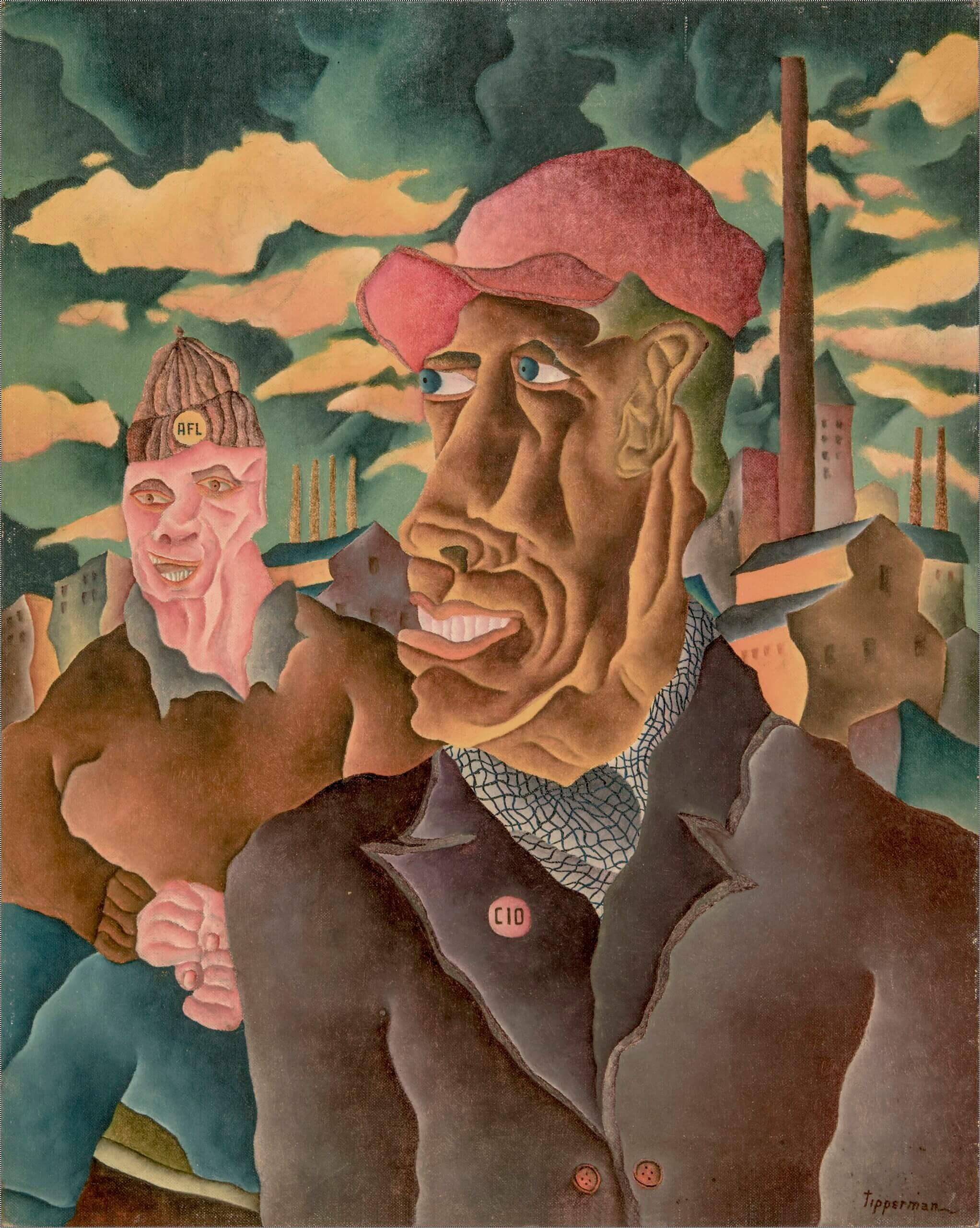
Kathy M. Newman: I love that, and I think we see it in this next painting, Labor Unity. Some of the things I notice is that the angular planes of the face look like miniature landscapes. Another visual detail that really strikes me is the kerchief that the front figure is wearing, which looks like it is covered with spiderwebs. He appears to be African American. He is wearing a button that says “CIO,” and the man behind him, who is white, is wearing a button that says “AFL.”
(editors note: “The Committee (later Congress) for Industrial Organization (CIO) emerged out of the American Federation of Labor (AFL) which had organized primarily skilled, male workers The CIO focused on organizing workers who had been ignored by the AFL unions. T)
Patricia Hills: One thing I’m noticing is that the Black man is so much larger than the white man behind him. It seems appropriate that the Black worker is the one who is aligned with the CIO, since the CIO had more communist members and organizers, and the Communist Party was fighting for racial equality. The Black worker is looking West, perhaps toward hope? The white worker is looking at us. The white man is inviting us in, and the Black man is showing us the way. One last thing I noticed: The clouds are ominous. They’re not nice, soft, fluffy, bouncy clouds. And there is a kind of a regimentation of the smokestacks in the background.
Kathy M. Newman: Like the picketer in the last painting we looked at, here the buildings can’t quite hold themselves up. They seem to be waving or collapsing or undulating.
Patricia Hills: One thing I’m noticing is that the Black man is so much larger than the white man behind him. It seems appropriate that the Black worker is the one who is aligned with the CIO, since the CIO had more communist members and organizers, and the Communist Party was fighting for racial equality. The Black worker is looking West, perhaps toward hope? The white worker is looking at us. The white man is inviting us in, and the Black man is showing us the way. One last thing I noticed: The clouds are ominous. They’re not nice, soft, fluffy, bouncy clouds. And there is a kind of a regimentation of the smokestacks in the background.
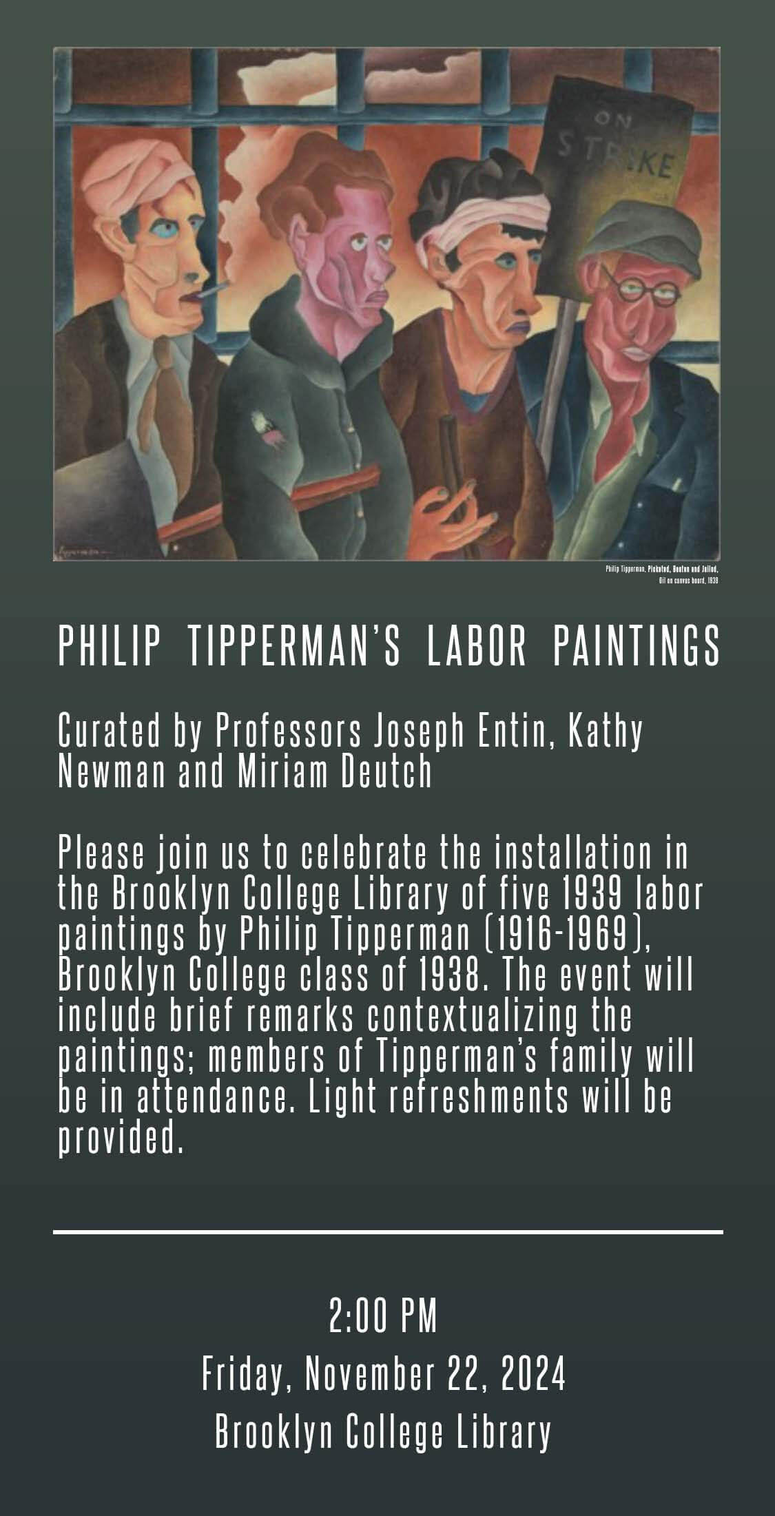
Kathy M. Newman: We’ll go to Picketed Beaten next. . . These men are bleeding, torn and bruised. . .
Patricia Hills: We’ve been talking about the collective versus the individual. There’s something quite nice about this picture. And that is, that the clothes all seem to kind of create their individual personality. Their clothes are quite beautiful, the way they flowdown, and how the figures are dressed differently. One has a necktie on. The men’s faces are differently colored, but also nonracial. Tipperman has brought these people together, these “people of color.” In his use of color he seems to be gesturing toward categories of race and ethnicity.
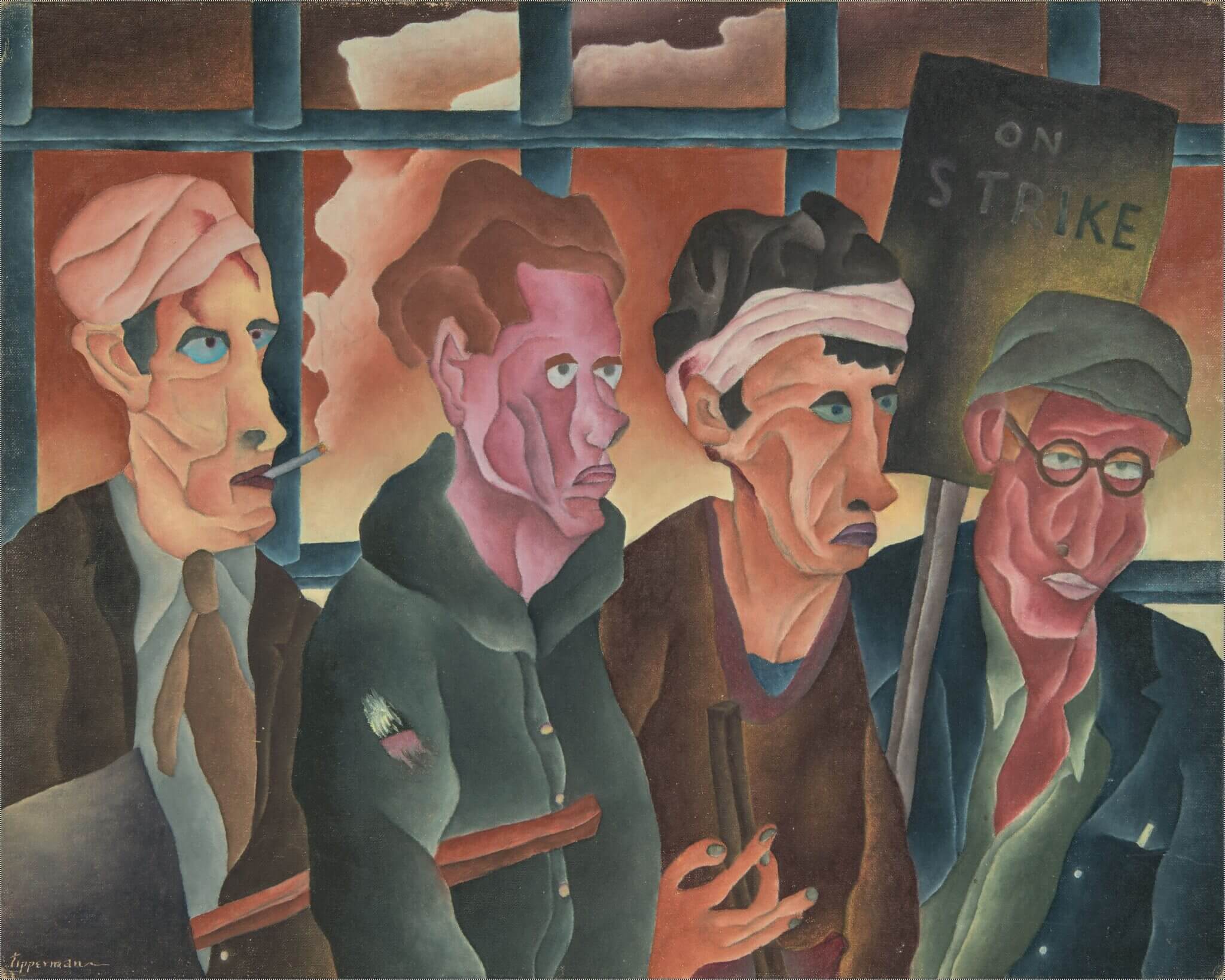
Joseph Entin: . . I’m also struck by the range of colors represented in the faces, which again I find really provocative and interesting, as establishing a play on these issues of individuality and collectivity. The faces convey some despair. They’ve suffered some kind of defeat, but they’re also standing shoulder to shoulder, and so there’s some resolve, too, even in this moment of setback. They are in jail! This work is so loaded with tension.
Kathy M. Newman: So I’m going to share the next one, titled Murdered By.
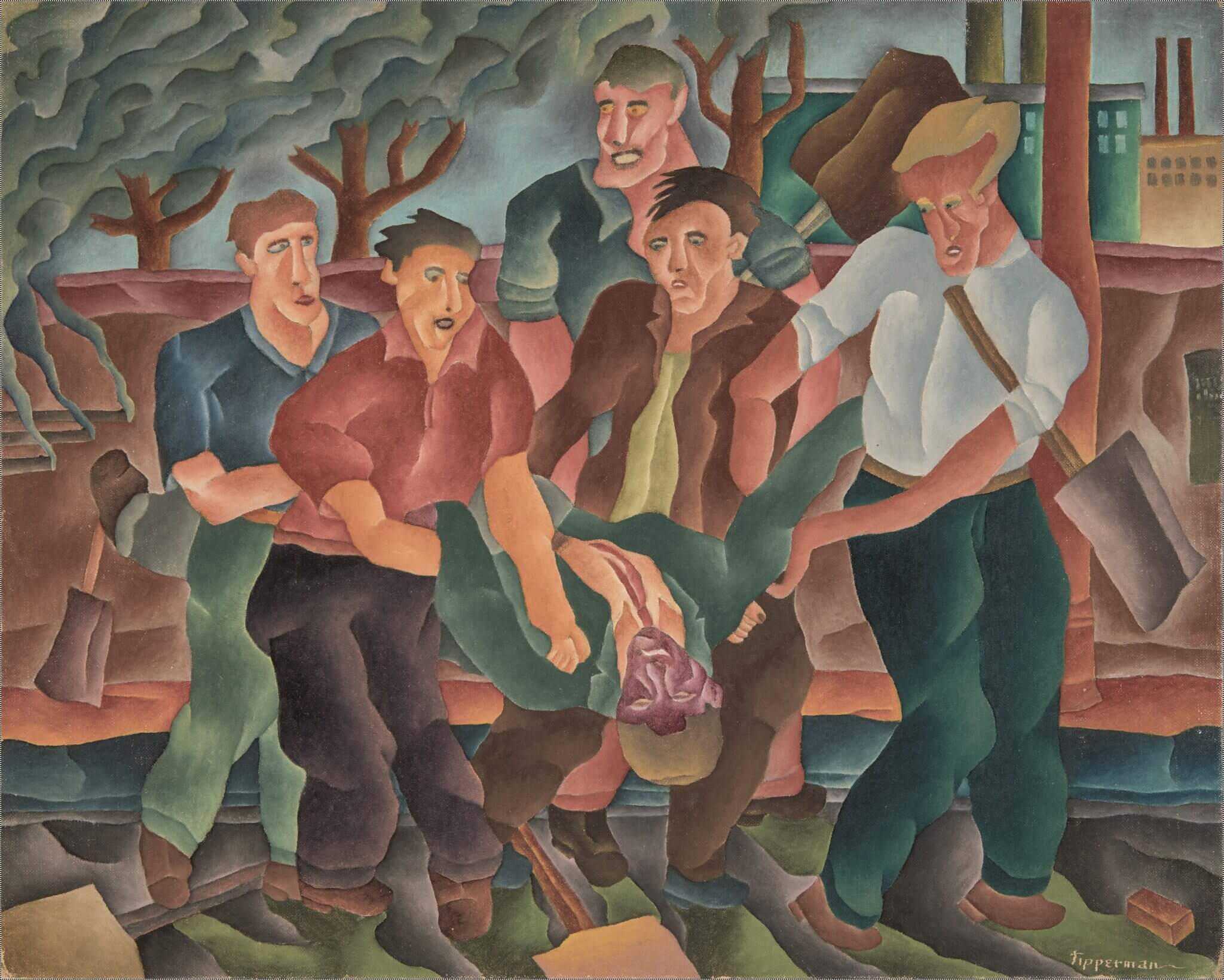
Patricia Hills: This painting is very unusual. In a lot of 1930s art we see policemen beating people. But to have somebody actually murdered, we don’t see that very often as the subject of paintings from this period. Here again we have Tipperman’s interesting use of color in order to indicate race. . .
Placing the dead African American man front and center in the painting draws attention to the fact that no group during the Great Depression was harder hit than African Americans. By 1932, approximately half of African Americans were unemployed. In some Northern cities, many whites called for Black men to be fired from any jobs as long as white men were out of work. Racial violence became more common, especially in the South, and the large tree branches in the upper left segment of the painting raise the history of lynching. Here, however, Tipperman, portrays white workers supporting the Black man and in solidarity with him. . . .’
Joseph Entin: . . .I think Tipperman is cutting against the grain in that the white men treat the Black man as a brother, a comrade, and that they are carrying him, honoring him. But in doing this, ironically, there’s the potential to reconstitute the same kind of racial dynamic that might have created a lynching, which is to say a white mob descended on a Black person
Kathy Newman: Another phrase that comes to mind in looking at Tipperman’s work is a phrase that Michael Denning uses in his book The Cultural Front, which is an aesthetic category he calls the “proletarian grotesque.” Denning uses this, in part, as an alternative to the concept of social realism, something we’ve been talking about in relation to these paintings. Tipperman’s figures are grotesque, misshapen, and awkward. How do you depict working-class struggle? One answer is the “proletarian grotesque.”
Patricia Hills: . . .What is ugly? What is beautiful? When we think of beauty we think of Greco-Roman and Western European art, with all that symmetry and those beautiful bodies, and then here in the 1930s we have these ordinary people who have a beauty aboutmthem, but the beauty is not in their faces, or in their bodies; it is on the inside. The beauty is in their intentions, in their humanity.
Kathy M. Newman: This is a great segue into the last painting we’re going to look at. This piece is called After Work.
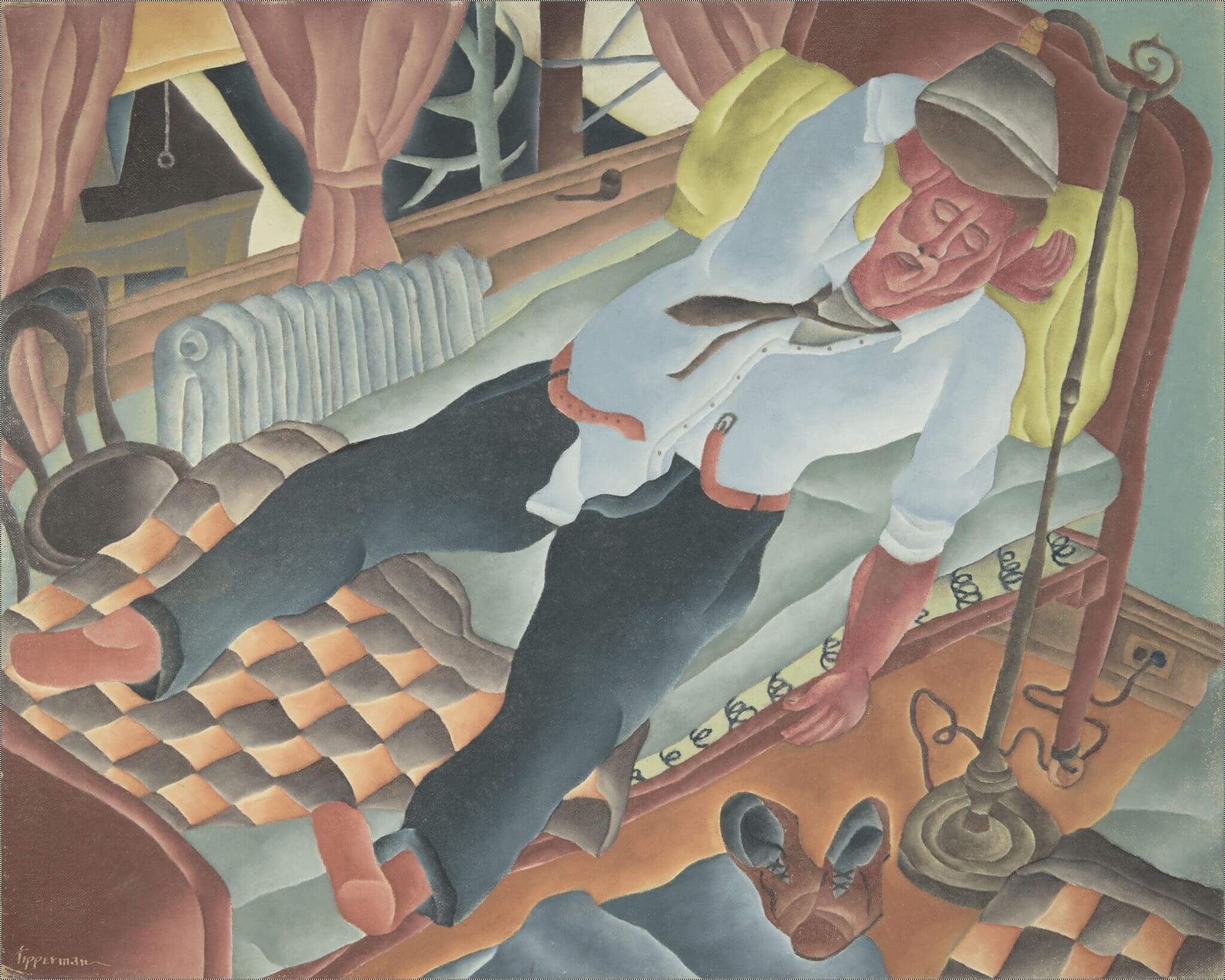
Joseph Entin: So, this figure is in bed, in his clothes. His tie and collar are slightly undone, and his belt is unbuckled. The belt looks like a snake! His shoes are on the floor but he still has his socks on. He has collapsed into bed. There’s a statement here about the exhaustion of work, the overwhelm, and what is required for workers to recover, and perhaps his lack of leisure time. What kind of time do working people have for themselves? . . .
Patricia Hills: I love this painting. I love the details. Look at the little round pull on the shade behind him. We’re up high in this room, we can see the top of a building across the street when we look out the window. . . .
Kathy M. Newman: I too love the details of the room and the window. . . Tipperman has put so much care into creating a three-dimensional checkered patterned blanket. But also, the angles of his body are twisted and grotesque. He’s broken. He’s not comfortable or relaxed. His body is tortured and misshapen.
Patricia Hills: Yeah, he looks exhausted. He’s not even in the pose of someone sleeping. He’s just sprawled. He’s passed out.
Joseph Entin: I agree! . . . And I want to go back to something Pat was saying earlier, which is how this painting is beautiful and also ugly. Was this one of the challenges of the artist who wanted to represent working-class life in the late 1930s? There was an impulse to portray working-class people—people who have been marginalized—to make them beautiful, to put them at the center, to make them large, to make them commanding, to make them graceful. On the other hand, Tipperman might not have wanted to diminish the horror, the pain, the injuries, or the uglinesses that characterized working-class experience in this long industrial era, and still do today. . .
Patricia Hills: You know, I’m struck by these wonderful nuances and colors. I’m realizing that Tipperman’s colors are colors that women wear in this period. These dark turquoises, teals, and rust colors, the light greens. And here are all of these beautiful colors undulating with the help of this watery style.
KATHY M. NEWMAN is the associate editor for Arts and Media at Labor. Her forthcoming book, How the Fifties Worked: Labor, Film, and Television in the Age of the Blacklist, will be published by Rutgers University Press in 2026.
JOSEPH ENTIN is professor of English and American Studies at Brooklyn College, City University of New York. He is the author of Sensational Modernism: Experimental Fiction and Photography in Thirties America (2007) and Living Labor: Fiction, Film, and Precarious Work (2023), and coeditor of four other books, including, most recently, with Jeanne Theoharis, Until We’re Seen: Public College Students Expose the Hidden Inequalities of the COVID-19 Pandemic (2024).
PATRICIA HILLS is professor emerita of American and African American art at Boston University. Her most recent book is Painting Harlem Modern: The Art of Jacob Lawrence (2019). A Guggenheim recipient, and an experienced curator as well as scholar, Hills is an expert in nineteenth- and twentieth-century American art, genre painting, African American art, Cold War art, and art and politics