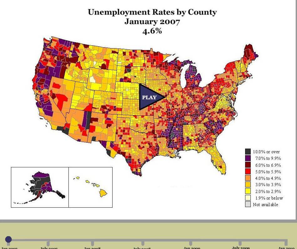
Labor and working-class historians ought to be thinking a lot more about interesting methods of data visualization. The internet is full of fascinating digital presentations that offer a quick understanding of immense amounts of data in forms that are often simple and elegant. From the prehistoric Journey of Man to the population of the U.S. coast to a brief history of a single person’s welfare income in Ontario, the possibilities for using some of these techniques for labor history are rich and largely overlooked.
Granted, we are all involved in our own labor processes–publishing and teaching–that do not encourage such work, but the future promises to depend increasingly on these amazing forms of story telling. Richard White has already expanded his work on railroads and the west with a variety of digital representations of spatial history. Another simple place to start is the U.S. Census Bureau’s site for an introduction to basic population visualizations.
Alternatively, you can generate your own visual aids with the National Historical Geographic Information System, which provides, free of charge, aggregate census data and GIS-compatible boundary files for the United States between 1790 and 2010. The NHGIS Data Finder (requires free registration) provides access to aggregate census data via an easy-to-use web based interface. The NHGIS also offers the Social Explorer, an online mapping interface that allows you to create and save maps, slideshows, and reports, all online. Data for Social Explorer are available beginning in 1940.
My favorite item uses ship logs to track the history of whaling globally. One can see populations of whales becoming exhausted and whalers moving on in search of more: (the read is great but also skip down to the video). In the future, keep your eyes on The Republic of Letters which is working on mapping discussions and letters among Enlightenment intellectuals. Both of these could readily be adapted to think about strikes, party formation, sectarian groups, and union organizing efforts.
There are many, many more approaches to this to discuss that might translate readily to issues of labor, inequality, politics, and class. If you have a favorite, let us know about it.

2 Comments
Comments are closed.